 Back in the film days, cross processing was the name given to the practice of developing slide film in chemicals used for developing negative film, and vice versa. Cross processing resulted in high contrast and sometimes wild color shifts. In the late 1980's and early 1990's, this was a common technique in vogue portraiture.
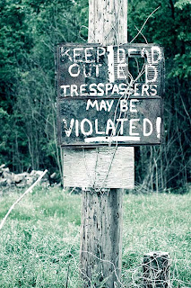
By separately adjusting the red, blue and green channels using a Curves adjustment layer in Photoshop (or by using a Curves plug-in for Photoshop Elements), you can achieve a cross-processed look. Here's an article discussing how I did this (and from which I took the historical information in the first paragraph). Here's my first attempt at cross processing, albeit on a sign. Actually, on this version, I duplicated the background layer of the original and used the SmartCurve plug-in for Photoshop Elements on that layer to do the cross-processing (users of the full-blown version of Photoshop can just use a curves adjustment layer). Underneath that is a channel mixer layer to convert the image to black and white. So, what you end up with is marginally colorized, cross processed black and white. Not really what I was looking for, but the full-color version just explodes with green grass, so for the full picture, it's a good compromise.
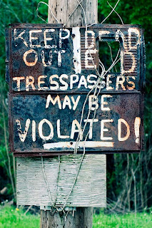
.jpg) But, of course, the object is the sign. Here's a cropped version featuring the sign, but without the channel mixer b/w layer. Which do you prefer? Maybe this would be a good candidate for selective coloring--b/w everything except the cross-processed sign? I really like how the cross processing brings out the contrast of the rust and weathered metal on the sign.
But, of course, the object is the sign. Here's a cropped version featuring the sign, but without the channel mixer b/w layer. Which do you prefer? Maybe this would be a good candidate for selective coloring--b/w everything except the cross-processed sign? I really like how the cross processing brings out the contrast of the rust and weathered metal on the sign.EXIF data: Nikon D80,ISO 100,Nikkor 50mm 1.8,f2.8,1/500
Manfrotto 3021BPRO Tripod (488RC2 head)
Sig Sauer P229 40 caliber pistol (just in case)
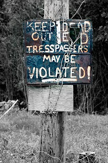
 UPDATE: I took a stab at cross processing the sign only, and leaving everything else black and white.


4 comments:
I definitely like the selective coloring version--it really makes the sign stand out, where the color version (even though the grass really pops), the effect kind of gets lost. This is a great picture--I would not want to be violated by the owner of the sign, as that is what would apparently happen if I were to trespass.
I wondered if this would work on a picture that I took out at the lake--it was a great view, but the picture was taken in late fall and the colors were kind of drab. I was amazed at the difference the Curve adjustment layer made. When I used the curves adjustment layer it made the colors much richer where everything didn't just blend in to the background, as a lot of my pictures do in the fall with bare branches and such.
Great picture & so glad for the posting--otherwise I would never have tried this!
Thanks!
Curves is like Levels on steroids. I'm pretty good at Levels, but horrible with Curves, probably because I can't do it as an adjustment layer on Photoshop Elements. Bob Johnson has a great website at www.earthboundlight.com. Go click on Photo Tips, and then click on Archives and then do a search for Curves--he has some great tutorials.
FWIW, I like the selective coloring version, too.
But, you know, I'm the person who thought Curves was just the name of an all-chick workout place. So take it with some salt.
Thanks Aud. I think this might look cool on metallic paper.
By the way, I cross processed the Sweetwater picture. It's not bad.
Post a Comment